Design elements
The Round-Cornered Principle
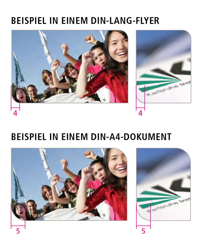
Starting from the KIT logo, in which a "round" fan meets a "square" font, the round-corner principle is a basic design element of KIT. Two corners of all rectangular elements are rounded. The rounding is always at the top right and bottom left.
The round-corner principle is used for media frames, picture frames, bullet points, charts, graphics, etc.
Picture frame
The rounding of the pictures is for:
- long DIN and DIN A5 formats 4 mm
- DIN A4 formats 5 mm.
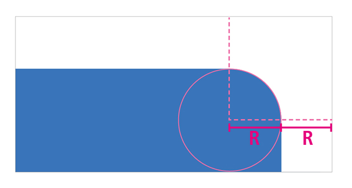
For formats larger than DIN A4, the rounding is increased proportionally starting from DIN A4. The radius of the rounding corresponds to the frame width.
The rounding of the images always remains the same within a communication medium - even if they are of different sizes.
Color: Black 50%, line width (print) 0.5 pt
Media frame
Variant white area
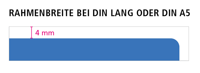
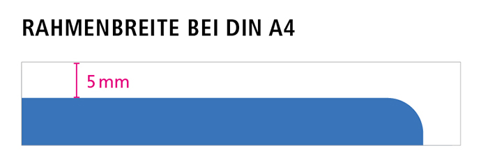
The top left and bottom right corners are at 90° to each other. The top right and bottom left corners are rounded.
The frame width depends on the size of the media:
- Business card: 2 mm (minimum size).
- DIN-long and DIN A5: 4 mm
- DIN A4: 5 mm
For formats larger than DIN A4, the frame is enlarged proportionally starting from DIN A4. The radius of the rounding corresponds to the frame width.
Outline variant
If no full-area image motif is intended on title pages, a simple frame - a so-called outline - is placed around the content to create a media frame.
Color: Black 50%, line width 0.5 pt


