General structure
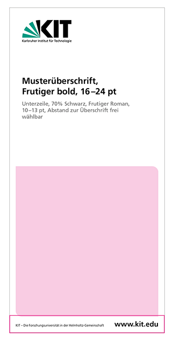
The printed matter is all structured according to the present scheme. The specifications for sizes and fonts are under "Raster and sizes".
1. logo
2. headline/title:
- The main headline is usually black, alternatively KIT green is possible.
- The subtitle is either black or 70% black.
- The headline sits flush left to the KIT logo.
3. image:
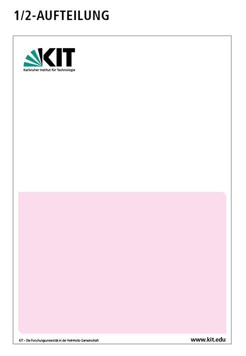
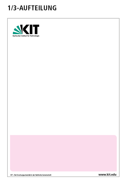
- An image box is provided on each title page.
- It is mandatory to use the round-corner principle. The size is freely selectable in coordination with the headline. A 1/2-, 1/3- or 2/3-split is recommended.
- If the image motif runs out to white, a thin outline in gray (50% black, line width 0.5 pt) must be placed around the motif to create the white space.
4. page footer:
- This area must not be changed.
- Internet addresses of OU are not allowed in the page footer.
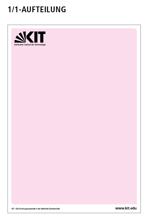
Background full color.
KIT logo white or black (depending on background color).
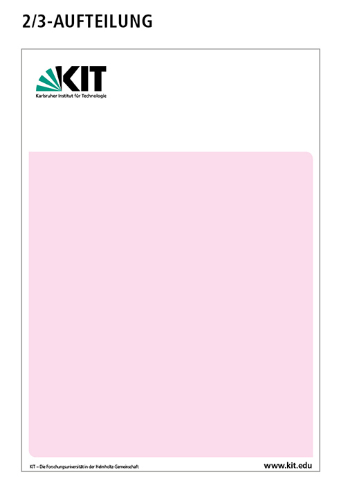
Background only up to protection zone.
Upper area remains white.
KIT logo in color.
Inside pages
Typography
The Frutiger font is to be used. Font sizes and line spacing can be freely chosen. A line spacing of 150% is recommended.
Layout
The layout of the printed matter is freely selectable. There are no specifications for the placement of images and graphics. On the inside pages, the round-corner principle can be used for images.
Back page
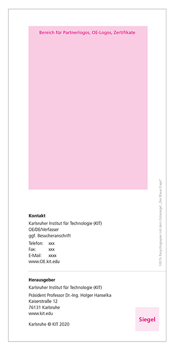
On the back side there is information such as contact details or directions.
Layout
- The upper area of the back page can be designed individually.
- Texts, images, graphics and additional logos can be placed freely.
Imprint
- The lower half is used to place the imprint.
- Contact details of the Business Unit are listed above "Published by".
- After "Published by", the KIT is always mentioned with the president".
- Font "Contact, Published by" Frutiger bold, 8 pt
- Font "Address" Frutiger light, 8 pt, ZA 11 pt
Blue Angel" quality seal
In accordance with the Executive Committee resolution of May 30, 2016, recycled paper with the "Blue Angel" seal of approval must be used for all published printed matter. A corresponding notice must be applied.
Optional seals
Seals (e.g. the audit logo) can be inserted optionally in a specified size and position for specific occasions. See also additional logos

