Design elements for videos
General
This page shows examples for the design of
- titles,
- belly bands,
- captions and
- credits.
For detailed information, dimensions, and more examples of video design, see the handout.
Title/Intro
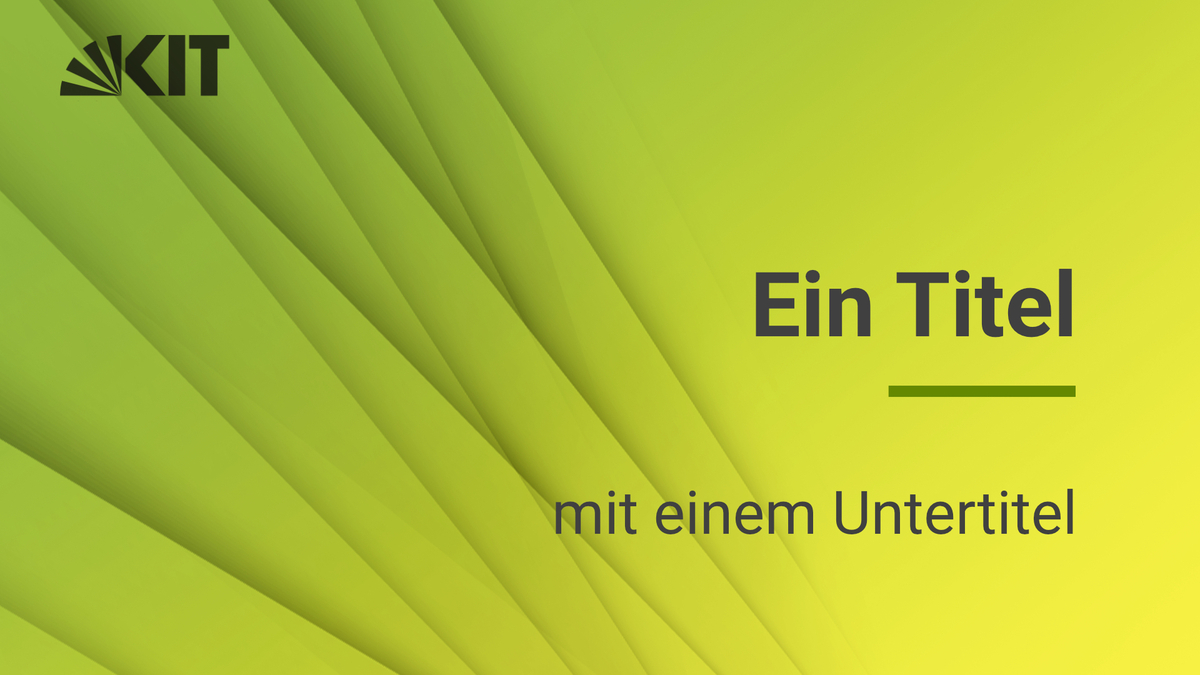
Title backgrounds are composed of your own image or one of the three KIT image motifs (shadow shapes, shadow fans, shadow dots) in the color gradients.
- KIT green - KIT blue for general, overarching KIT themes,
- Light green - yellow for the energy theme,
- Light green - light blue for the mobility theme,
- Blue - Purple for the topic of information.
Information and download of the image motifs
- The KIT logo with 20% transparency is placed on the top left. The choice of logo color (black or white) depends on the higher contrast to the background. For your own motifs, please ensure sufficient contrast. The contrast can also result from the movement of the background. For better readability, the KIT logo is used in special form (without subline).
- Font for texts: Roboto
- Color of the line: This can be colored individually with colors from the KIT color palette.
Belly band
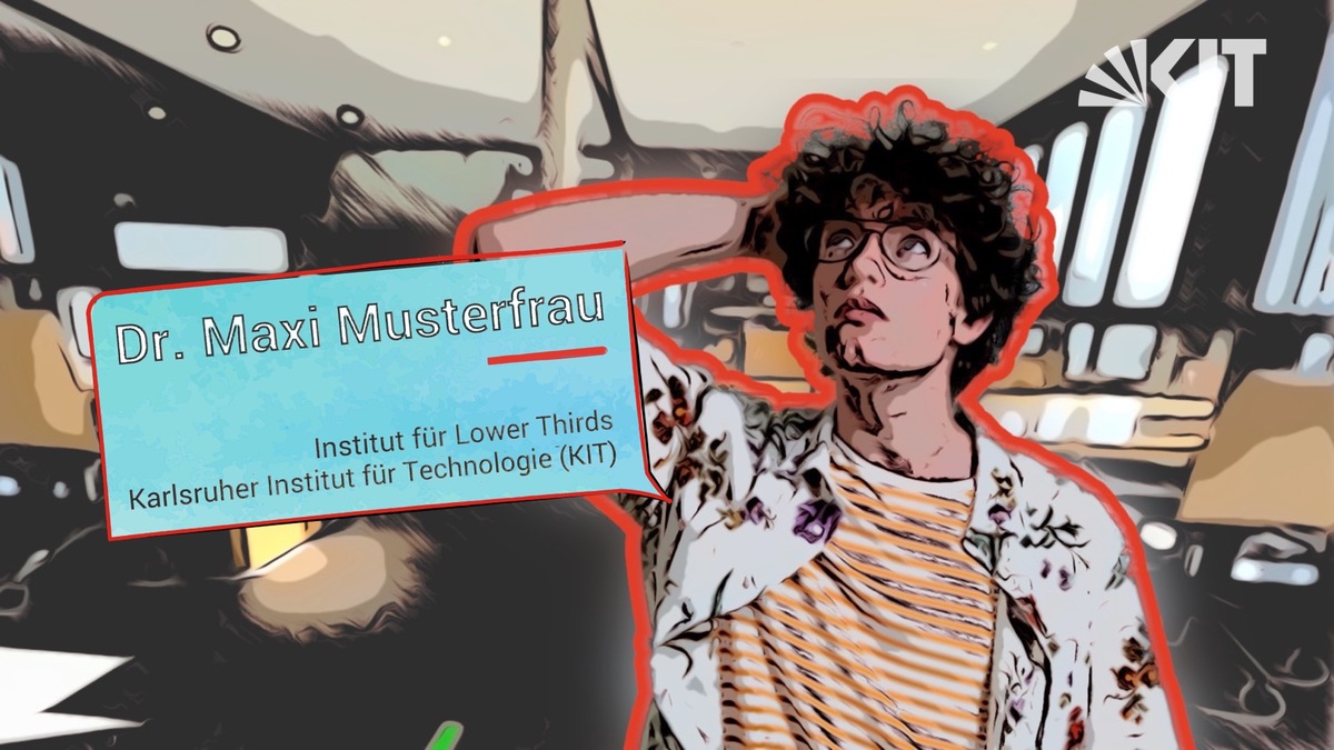
Belly bands can be plain or - optionally - provided with an area element. For the display duration of the belly band, the KIT logo (in special form without subline) is faded in on the opposite side at the upper edge with 20% transparency for members of KIT. It is not used for external users.
PNG files with already set logos can be downloaded in full HD and in 4K.
For KIT members, please enter "Karlsruhe Institute of Technology (KIT)" or the German translation as subtitle.
A PowerPoint template including instructions is available for download.
Captions / text overlays
Labels and text overlays are structured in the same way as belly bands. The line is a fixed component. With background area, the corner points to the element to be described. Without, the line takes over this function.
Credits
- Contributors, logos of partners, source information, licenses find their place in the credits.
- In the credits, the full KIT logo (with subline) is mandatory to be used at the top.
- A line is inserted flush above the text. It has the same size ratio as in the title.
- Logos of organizational units and projects must be significantly smaller than the KIT logo in the hierarchy (max 2/3).
- To better distinguish contents from the background, gradients can be used. Provided that no subtitles that can be switched on cover the content, a gradient from below is also possible.


